Finally getting to the important features
As you might have noticed, things are suddenly slightly different - the blog's design suddenly looks a little less 2012, big posts get a "table of contents" widget, and there's a dark theme switch!
In this post I take a look back on how my website originally came to life and how it changed over time.
The past
In years 2008-2009 I frequent a few game development related forums and sometimes make small examples on how to do one or other thing (mostly for GameMaker).
I make series of not-so-smart decisions in picking where to host the files, and as result have to periodically re-upload them (and subsequently fix links in my forum posts) as websites mysteriously implode (supposedly as soon as realizing that it costs growing amounts of money to support them).
2010: Plain PHP
Who needs an actual sub-title when you can have a silly sub-title?
At one point I decide that I've had enough of manually updating forum posts, and should instead make my own website, and host files there. That one's not going to mysteriously implode... right?
I pick a random remotely competent looking free website host with PHP support and assemble a simple website. The functional part conists of a header.php, footer.php, and series of individual pages referencing those.
You may say "hey, that doesn't look too bad", but here's the catch: those borders and rounded corners are table cells. The entire website is a 9-row (3-section) table. But it worked. So, yeah
2011: Free host, free trouble
Late 2011 marks the first time a project of mine got written about anywhere, and also a brief introduction to why you need to research free website hosting better:
As soon as my website's bandwidth crosses 1GB, the hosting service conveniently fills it with casino ads. To brink - two banners, a popup, and a popunder on clicking anywhere. I get the first hate email from someone saying that they couldn't believe that a solo game developer could be this greedy.
I quickly move the download to GameJolt before the month ends, but, alas - that's it, ads forever. I insert a snip of JS to disable popups/popunders and start looking into other options. 3 years later, as the website's traffic is effectively zero [for fact of me having moved everything to a new site], I get an email that it was suspended for a ToS violation. Good on you, or, whatever.
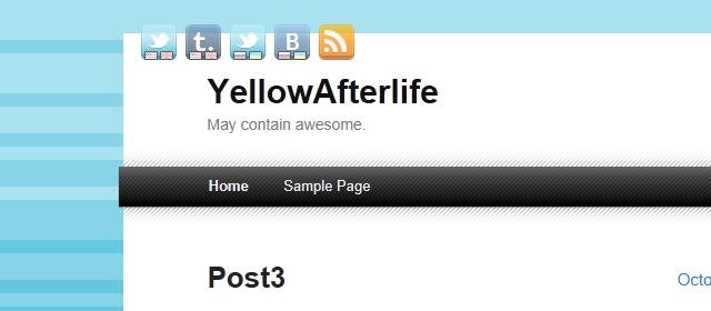
2011-2012: Chyrp
Silly sub-titles continue. This one was a dated reference even back then.
From late 2011 to mid-2012 my website ran on Chyrp.
A friend of mine hosts it on a server together with a few other small websites.
Chyrp was a lightweight PHP framework for blogs. Really strong focus on the "lightweight" part - you could even enable a flag and have your website compiled almost entirely into static HTML, with a few catches.
Curiously, none of the archived copies have a stylesheet - this little trimmed screenshot is the only thing left, and even then I'm not 100% sure if it's of Chyrp version or some early WordPress test.
Regardless, it existed, and was running a variation of some common theme.
In 2012 the website moves to it's current domain of residence, availability of which comes as a big surprise considering that most 3-letter domain names were already squatted by companies trying to sell them for thousands of dollars.
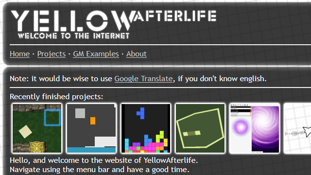
2012: WordPress
Will I ever use an actual sub-title on my blog? Doubt.
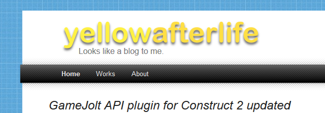
As 2012 goes on, it becomes increasingly apparent that, while Chyrp offered better performance (slightly irrelevant for little to no visitors), finding themes/plugins/help was very problematic.
So I switch to WordPress, find some plugins of interest, stare at themes for hours, and decide to just take one of the standard themes (TwentyEleven) and edit it till it looks like what I want.
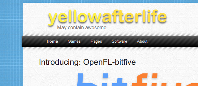
Here you can see an early version that still looked fairly alike to "vanilla" TwentyEleven, but some distinct features are already in place - like the diagonal-striped menu bar.
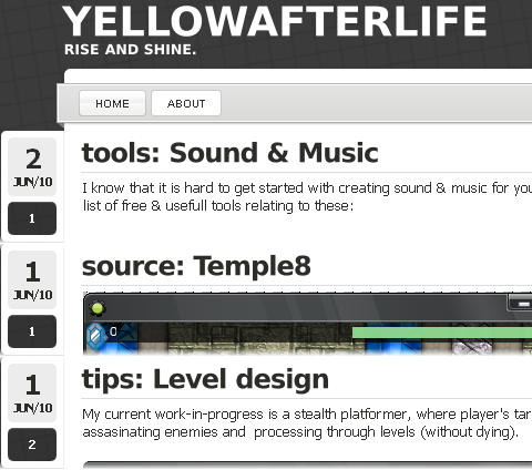
2013: Familiar looks
I don't know what that logo font was, but I don't have it anymore
By 2013 most of the established design pieces were already in place - the subtle paper texture, the vibrant blue grid background, and the general set of fonts and sizes.
Also seen: my undying optimism for starting things that take hundreds of hours of work.
2014: Sub-titles and Patreon
The most important detail, randomized silly sub-titles
In 2014 my website looked mostly like the 2013 version, but the extra menu buttons are now gone, and instead of a single sub-title there's a random rotation of them. Please consider the following diagram for my general stance on this:
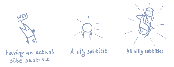
Note that I didn't promise that any of this would make any sense
The other addition was the Patreon button:

Just imagine, being able to spend time on tools and tutorials without the ever-lasting dread about doing this instead of work that actually pays your bills.
Obviously, such thing could not simply happen - my Patreon page struggled to gain much traction, at peak being $60/month, of which I'd see $35 after fees, rejected pledges, and people just abusing that day's system to subscribe, download stuff, and unsubscribe without being charged anything.
So, after about a year of trying to maintain a consistent posting schedule in spite of receiving monthly sums akin to what I was paid for work in my areas of expertise per hour, I had to admit that this wasn't working out very well at all, and went to mostly just doing contract work.
In combination with me graduating and suddenly having real expenses, the posting frequency took a hit and settled on the current state where there's usually 1 post per 1-3 months unless there's a unexpected influx of free time due to project schedules misaligning.
2015: Accidental branding
Perhaps one of the most distinctive qualities about my current-day website and store page designs is the combination of calm blue/white background colors and dark blue/black foreground colors.
And this happened largely on accident - when I was doing promo artwork for my platformer engine, I settled with combination of this specific shade of blue (which happens to be close enough to my avatar's background) and white, and a condensed font because the oversized name just wouldn't fit in otherwise.
Then, when I was doing artwork for the next asset, I reused the same colors, but settled for a simpler icon structure, as the name wasn't nearly as long. And when doing the next asset's art, I just used it's art as a template...
... three years later, I have over three decades of assets, all using a consistent theme, so you could say that this worked out pretty well.
Other things that happened in 2015 include me working on Nidhogg for the first time, and me making a handful of online multiplayer mods using source code from Humble GameMaker Bundle.
2016: A busy year
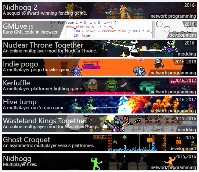
I might have worked on too many things at once that year.
2016 was a year during which I did netcode for six different games, worked on two mods, and released GMLive.js.
That said, the blog wasn't paid much attention - I wrote a few posts and that was it.
2017: The fancy things
2017 was a wonderful year - I added GML scripting to my Nuclear Throne mod, then was hired to work on the official Nuclear Throne update, and released GMLive.gml, which I'd consider to be my best GM extension to date.
For the blog, I came up with the current workflow used for interactive demos (which by means of Haxe and Google Closure optimization produces mere KBs of JS code, often smaller than images of them), and implemented a new system for GIFs and full-size previews. See this, for instance:
 (mouseover/click to play GIF)
So there is a static preview, and if you mouseover it (or tap on mobile), the GIF loads and starts playing. And it's responsive. And it works seemingly everywhere, even in Opera Mini. And it works with JavaScript disabled (except on iOS. As if nothing is ever just right on iOS).
Also the posts are now written in the same custom Markdown variant that I use for documentation, which makes it easier to do purpose-specific template insertions (such as with GIFs).
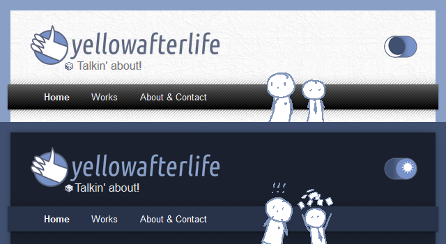
2018: A design refresh
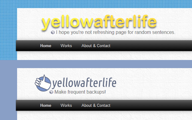
Before and after
While the thought of updating the website's design a little had been on my mind since at least 2016, it did take a while till finally settling with a design that works and looks good.
So, in order:
- The logo was updated to a combination of "thumbs up" (originally part of my avatar and used as an emoticon) and familiarly styled text. Also fits mobile screens better.
- The background was updated to match the calm blue color that my assets use (see: branding).
- The dark theme's colors were based on ones that I use for my asset docs.
- The navigation menu is really simple but was only made possible by tweaking the theme to use CSS flexboxes for content+sidebar (as otherwise the sidebar. Curiously, official WordPress themes still use CSS float for sidebars till this day.
The future
The future is bright, but there's still plenty more to do.
- Perhaps most importantly, I need to update my assets page to match the new format
(...and cover all the new things I made) - Although I'm pretty sure that it's incredibly apparent that I mostly do networking for games, I would like to write up a separate page categorizing all the other things that I can do as well.
- I want to set up a separate page categorizing the various tools that I made because there's a lot.
- And, of course, I have a todo list of 50+ posts that grows faster than I can tackle them
So that's about it, really. I hope this was interesting enough to read.
Have fun!